Sources: httphttpsdesktoppub.about.com/od/grids/l/aa_gridsorder.htm
Author: Jacci Howard Bear
Grids : Order Out of Chaos
Invisible Structures: When and Why to Use Grids in Page Layout
 Think of the grid as a plan — a plan for your page layout
Many of the pages that you see everyday have a grid. You may not see it but it is there, holding up the design, establishing structure, guiding the page elements.
A grid is an invisible structure used to guide the placement of elements on your page. Grids don’t appear on the printed piece but their influence may be evident in the widths of column texts, the uniformity of space around photographs, or the consistent placement of repeating elements from page to page in a magazine. They are a series of guidelines that determine the margins of the piece, space between page elements (headlines, body text, photographs, etc.), and let you know where to put things on the blank page.
Before deciding when, why, and how to use a grid you need to know the elements of the grid and how to create it. While it is invisible in the final printed piece, you’ll need to be able to see it during page construction.
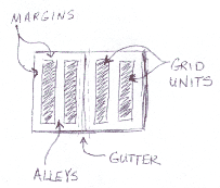
In your page layout, you’ve probably set margins. These margins often show up as light solid or dashed lines on the screen. These top, bottom, left, and right margins create a box in the middle of your page. Stop there and you have a single unit grid. Further divide the page into uniform parts and you’ve created a multiple unit grid. You can create a visible grid to aid in page layout using the guidelines feature of your page layout software or by drawing lines or boxes that you place on a non-printing layer of your publication. Often you can “pull” a guideline from the rulers on the sides of page and place them where you want them.

Margins & Grids
Margins define the outside boundary of your page. They frame the content of your pages. Margins may not be equal all around (but are normally consistent from page to page or panel to panel). In most programs you would set the margins when you define the page dimensions (format). You can also adjust the margins “on the fly” by moving the guides on screen (in some programs).
Alleys & Grids
When you divide the interior space of your page into uniform parts the white space between units are alleys. Depending on how you’ve set up your grid the alleys may run horizontally, vertically, or both directions on your page. In some designs this would translate to the white space or “gutter” between columns of text.
Gutters & Grids
In a two page or two panel spread, the gutter is the inside margin. It’s the space on either side of the fold. In some page layout programs the space between two columns of text is sometimes called the “gutter” as well.
 Grid Units
Grid units are the primary locations on your page where you will place text and images. They determine placement not necessarily size. That is, if you have a graphic image that is larger than your grid unit, it doesn’t mean you can’t use it. You would use your grid units to help resize the photograph — ideally to fill 1, 2, 3 or more grid units and then to place that image on your page.
Grids provide visual organization
Grids have different uses and may not be appropriate for all situations or all designers. Publications such as magazines and newsletters almost always require a grid. It provides page to page continuity. It also helps speed production because the designer doesn’t have to “start from scratch” laying out and designing each page of the publication.
In a series of single, but related pieces (such as a series of posters or information sheets for a single ad campaign or single product line) a common grid can help unify the separate pieces.
In a single piece that has many disparate elements (blocks of text, headlines, photographs, drawings) a grid can help organize these elements on the page.
‘;’ type=’text/javascript’>

